
Brand Identity • Art Direction • Social Media • Packaging
Overview
Ember & Ash is a conceptual boutique coffee brand built around the idea of warmth, ritual, and transformation. The goal was to create a brand that feels elevated and atmospheric—moving beyond typical coffee shop visuals into something more refined and emotionally driven.
The identity leans into contrast: fire and calm, boldness and restraint, energy and stillness.
Concept & Direction
The name Ember & Ash became the foundation for the entire visual system. “Ember” represents heat, energy, and beginnings, while “Ash” reflects what remains—quiet, grounded, and enduring.
This duality informed every design decision, from color palette to typography to image styling.
The brand is designed to feel:
• Warm, but not bright
• Minimal, but not empty
• Moody, but still inviting
Visual Identity
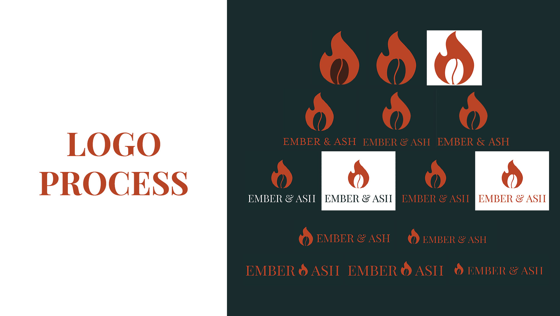
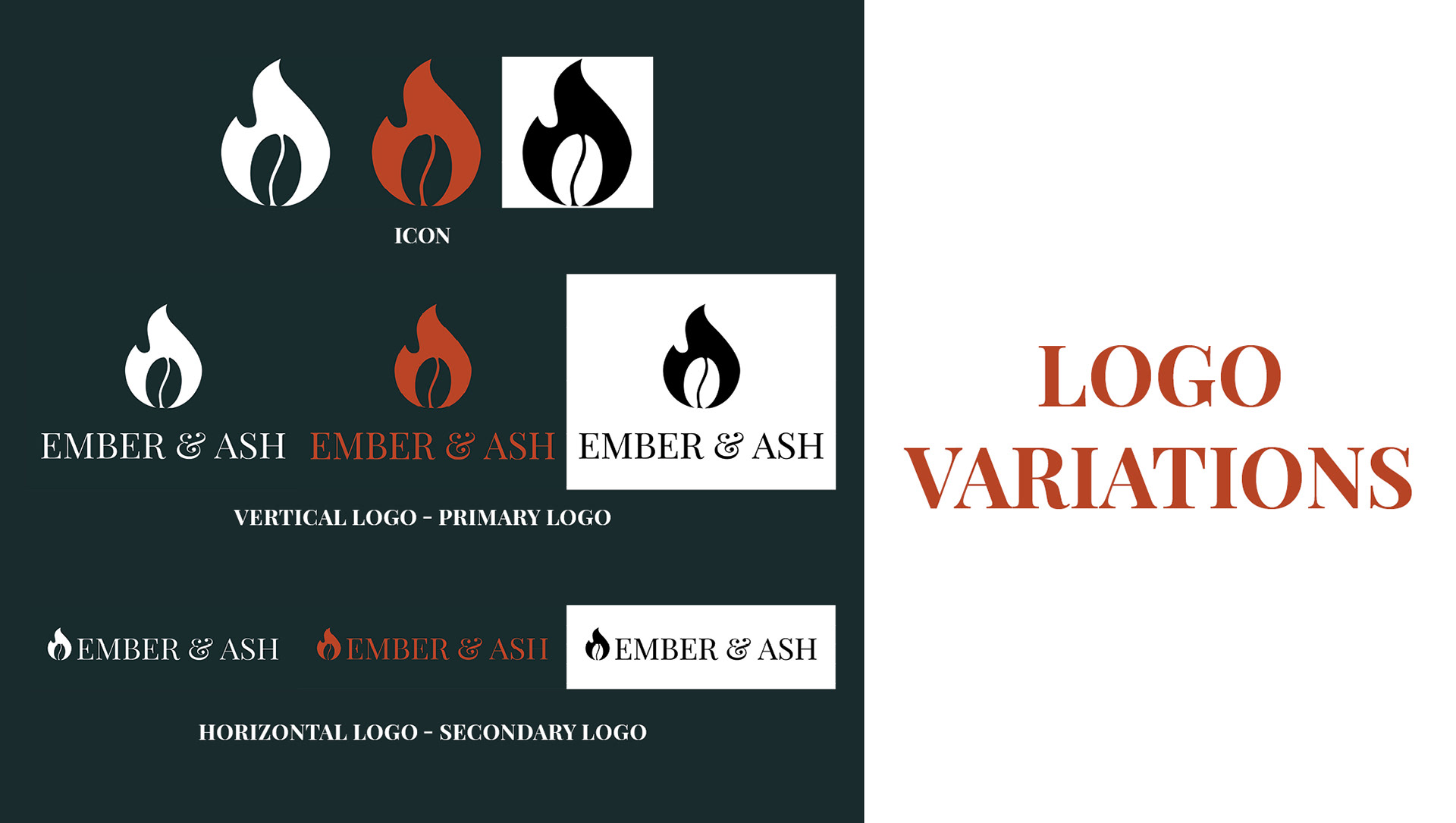
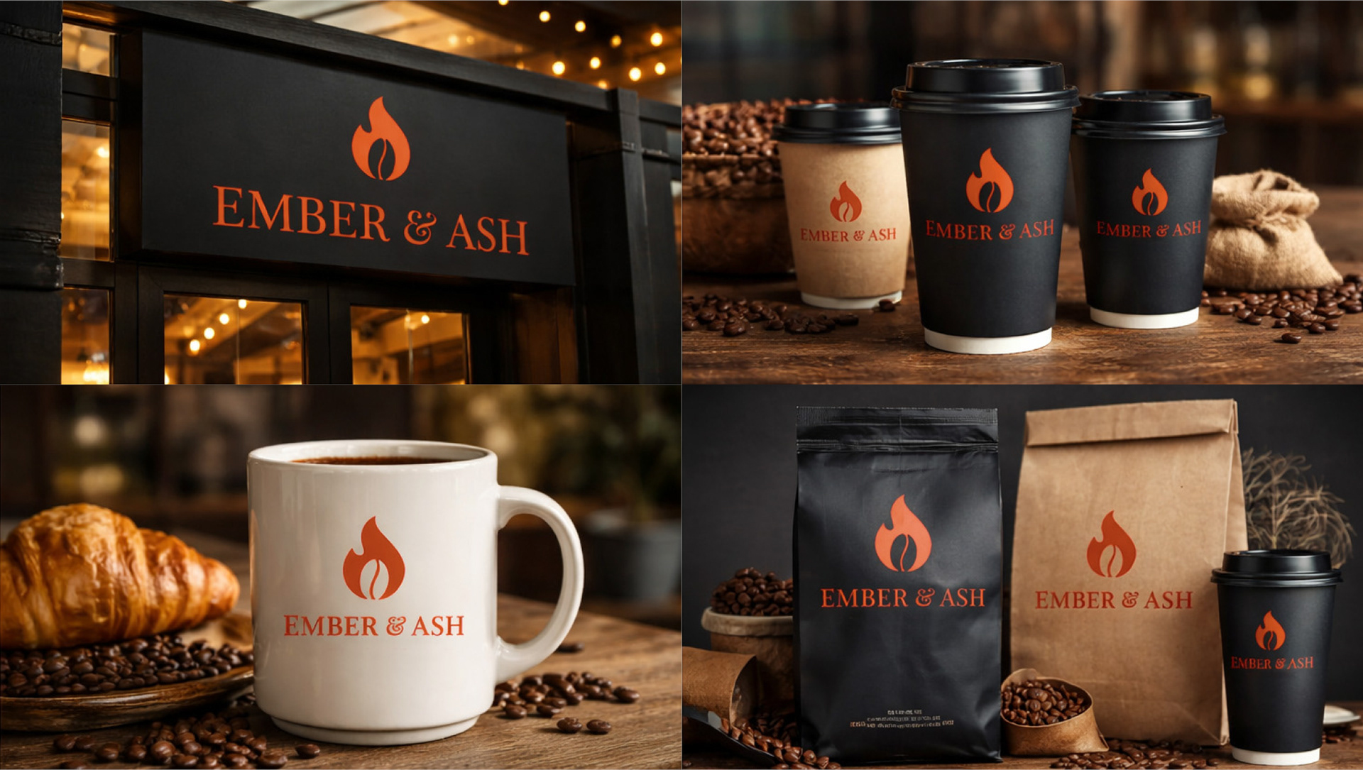
The logo mark combines a flame with a subtle coffee bean form, creating a simple but memorable symbol that reflects both the product and the concept.
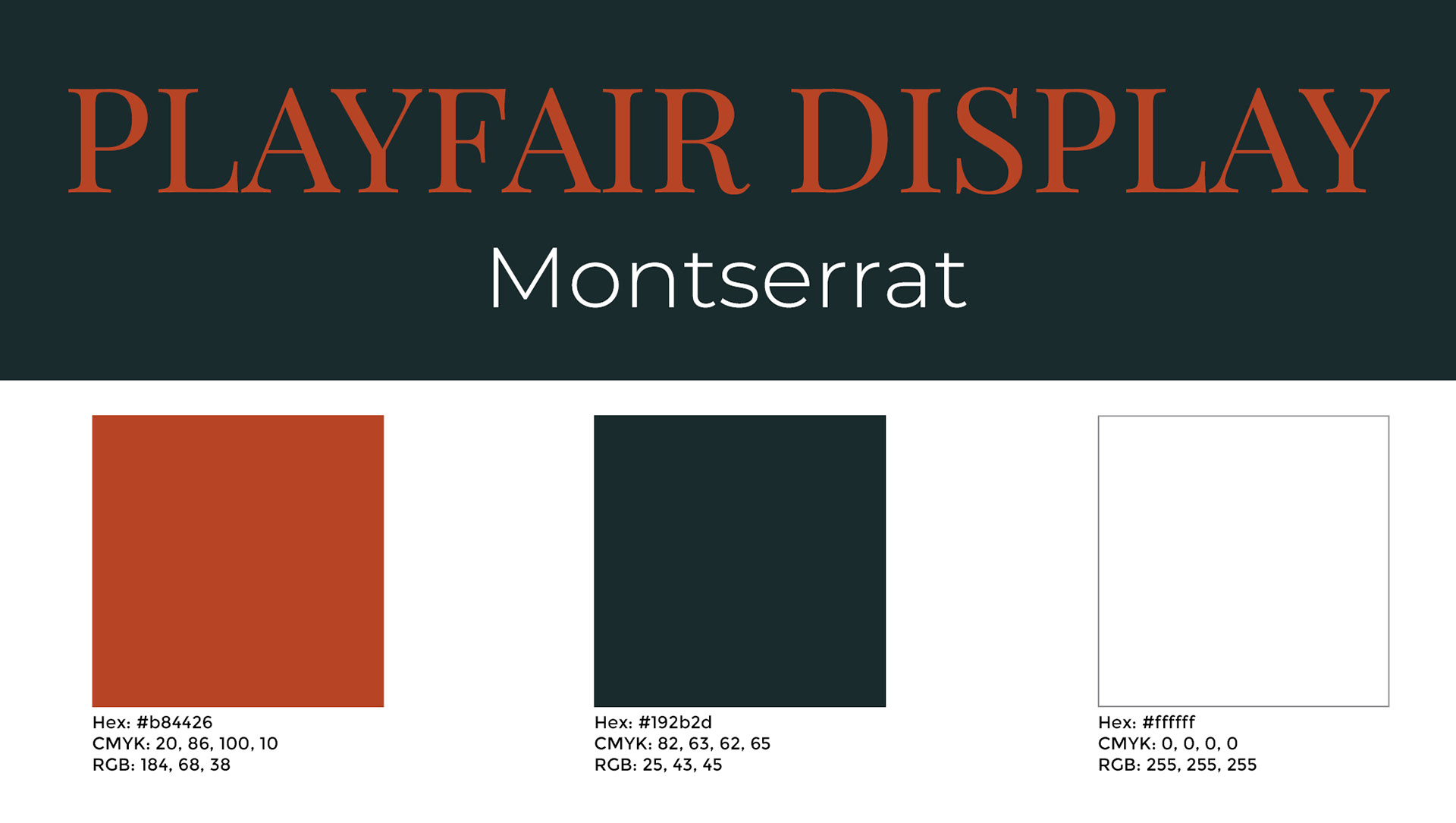
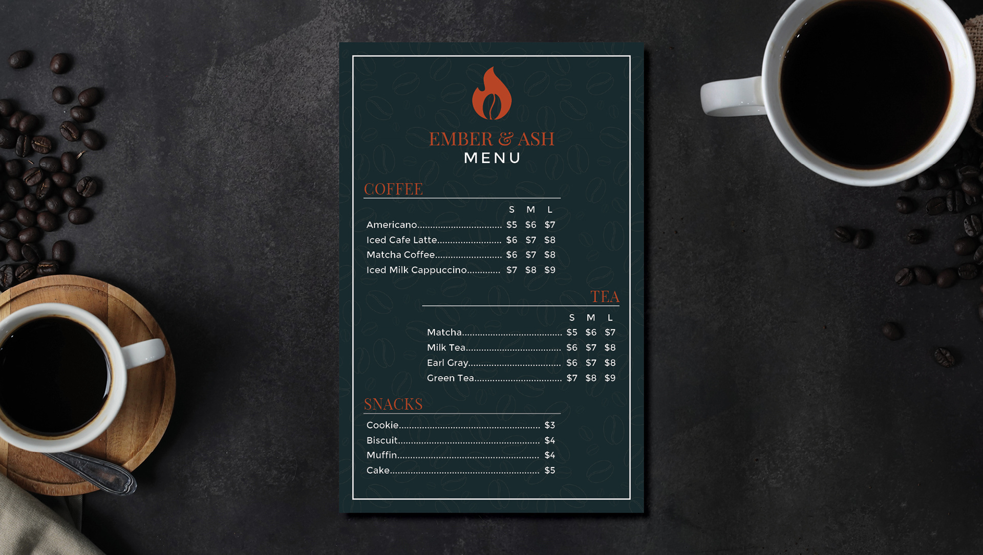
A muted, dark color palette paired with a rich ember red establishes a strong visual presence while maintaining a sense of calm and sophistication.
Typography plays a key role in the identity, balancing an elegant serif with expressive, handwritten accents to create contrast and personality.
Brand Application
The Ember & Ash identity was extended across multiple touchpoints to demonstrate versatility and cohesion.
Applications include:
• Branded coffee cups and drink visuals
• Packaging concepts for retail coffee bags
• Environmental signage and storefront mockups
• Social media content and campaign direction
Each application maintains a consistent tone—moody lighting, warm textures, and an emphasis on slow, intentional moments.
Social Media Direction
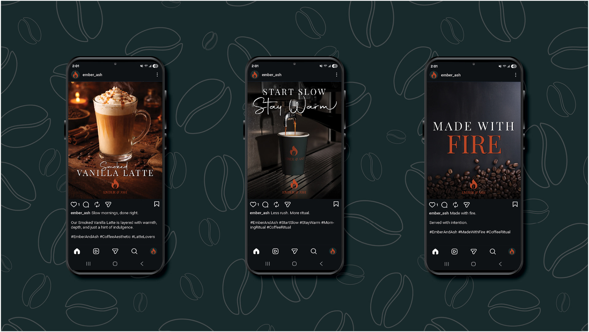
A key part of this project was developing a social media presence that feels curated and design-forward rather than promotional.
Content focuses on:
• Minimal typography-driven posts
• Cinematic product photography
• Short, poetic brand statements
• A consistent visual rhythm across the grid
Phrases like “Start Slow” and “Made with Fire” reinforce the brand voice while creating a recognizable and cohesive presence.
Outcome
Ember & Ash demonstrates how a strong conceptual foundation can elevate a brand beyond its category. By focusing on mood, restraint, and storytelling, the project creates a distinct identity that feels both modern and timeless.
This project highlights strengths in brand development, art direction, and building a cohesive visual system across multiple platforms.