

Design Systems • Large Format Print • Team Branding • Visual Consistency
Project Overview
The Hamilton Southeastern High School Girls Soccer program needed a cohesive set of materials that would unify their visual presence across game day, campus, and community touchpoints.
The goal was to create a system of designs that felt energetic and modern while remaining fully aligned with the school’s established brand standards—including official logo usage and a limited color palette of blue, grey, and white.
The Challenge
The team had multiple communication needs—game promotion, player recognition, and school spirit—but lacked a consistent visual system tying everything together.
• Each piece needed to:
• Feel like part of a unified collection
• Be easily readable from a distance (for outdoor and crowd environments)
• Maintain strict adherence to school branding guidelines
• Celebrate both team identity and individual athletes
The Solution
I developed a cohesive visual system that could flex across multiple formats while maintaining consistency in typography, layout, and color usage.
The designs emphasize bold hierarchy, strong contrast, and clean composition to ensure clarity at scale—whether viewed on a sideline banner or a hallway poster.
Deliverables
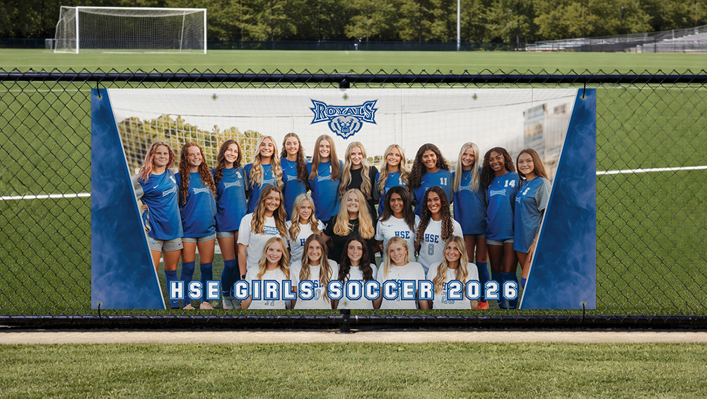
Team Banner
A large-format banner designed for high visibility on the field. The layout prioritizes impact from a distance, using bold typography and strong contrast to reinforce team identity.
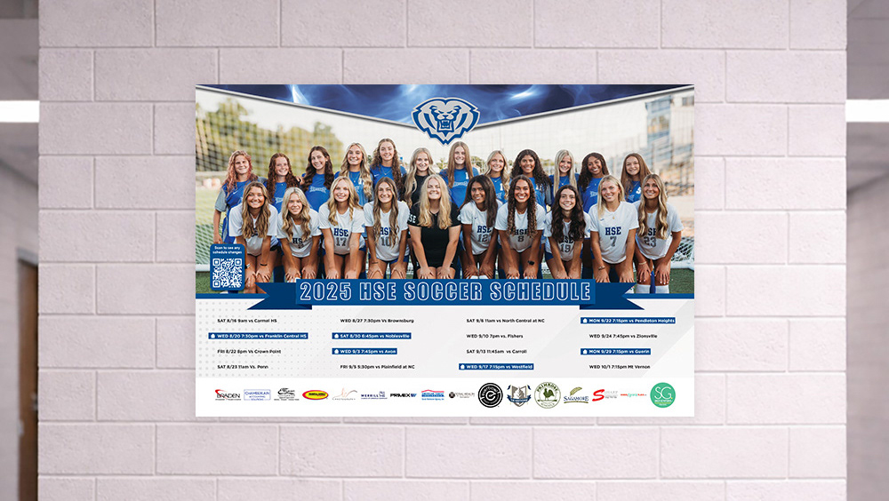
Schedule Poster
A structured, easy-to-read layout that organizes game information clearly while maintaining visual energy. Designed for both print display and quick reference.
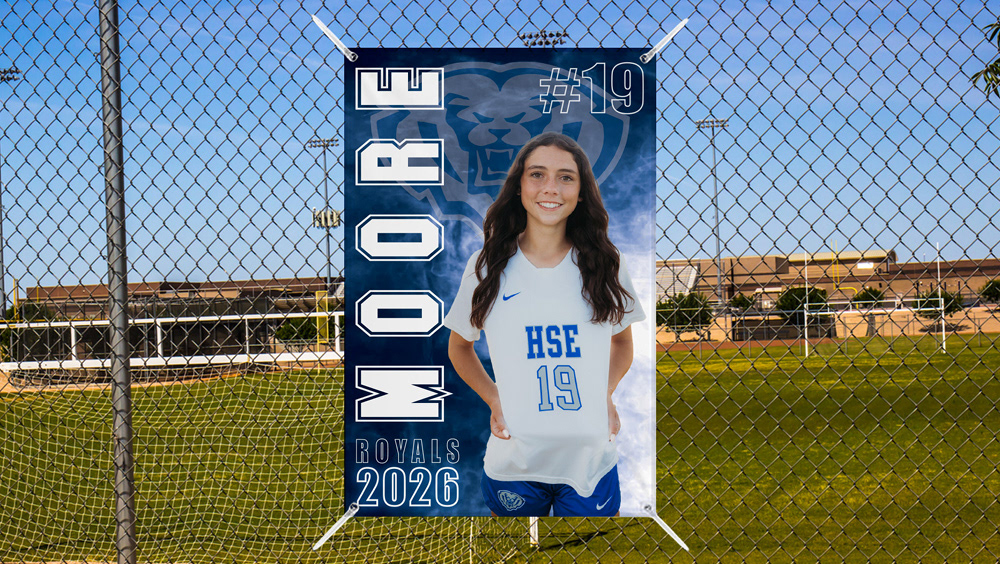
Senior Banner
A personalized design system to highlight graduating players. Each banner balances individuality with overall brand consistency, ensuring seniors stand out while still feeling part of the team.
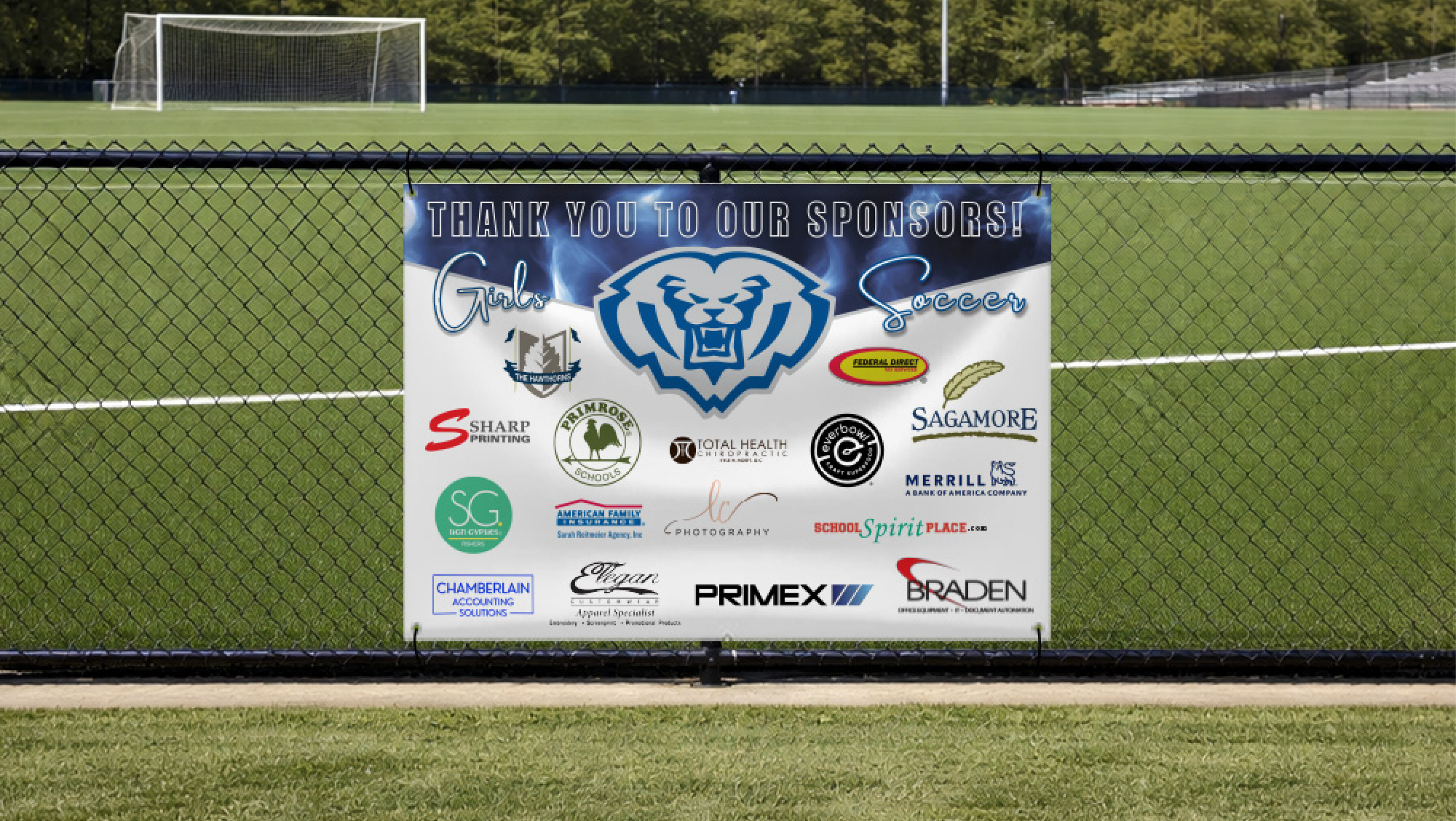
Sponsor Banner
A clean, organized layout designed to recognize sponsors while maintaining the integrity of the team’s visual system. The design balances visibility for multiple logos without feeling cluttered, ensuring readability and brand consistency in a high-traffic environment.
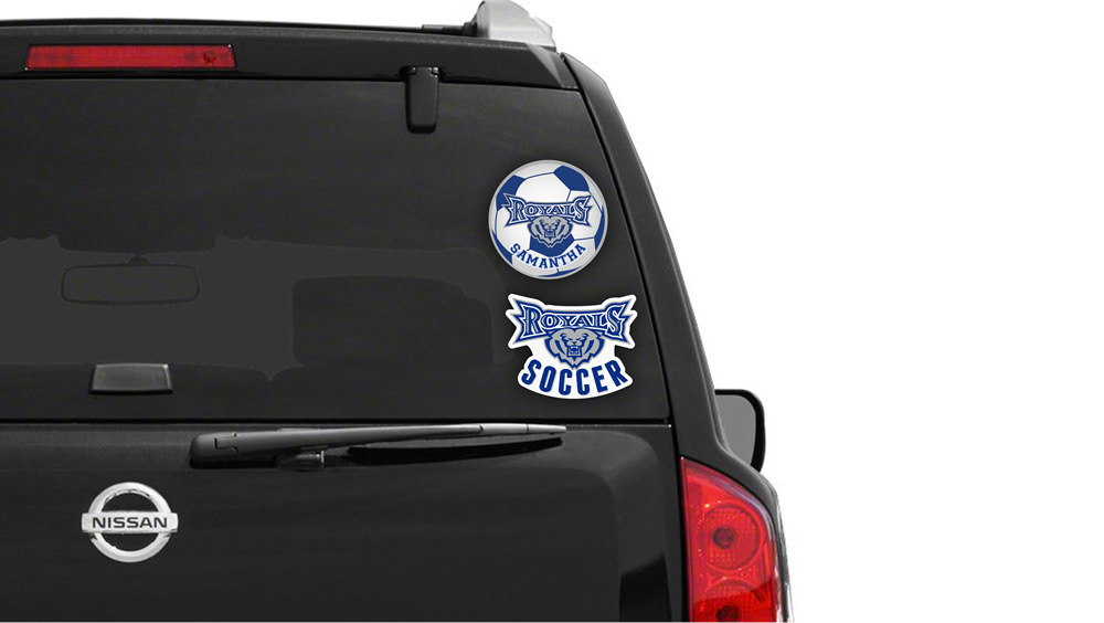
Decals
Versatile graphics created for use across multiple surfaces—lockers, equipment, and promotional materials—extending the visual system beyond traditional print.
Design Approach
Consistency Across Formats
Every piece was built from the same visual foundation—type, spacing, and color—creating a unified system rather than a set of disconnected designs.
Brand Alignment
All designs strictly follow school branding guidelines, ensuring proper logo usage and consistent application of the blue, grey, and white color palette.
Legibility at Scale
Given the variety of viewing distances, typography and layout were optimized for clarity—from close-up reading to long-distance visibility on the field.
Balance of Energy + Structure
The final system combines bold, athletic energy with clean, structured layouts to reflect both the intensity and professionalism of the program.
Outcome
The final collection provides the team with a cohesive visual identity that strengthens school spirit, improves communication, and elevates the overall presentation of the program across environments.